Monday, 18 November 2013

Magazine racks with style...

Are magazine racks a thing of the past? Some how when you even say magazine rack it seams dated... but people still buy magazines... what do they do with them? Leave them in a pile next to the sofa? Read them and chuck them away?

I am one of those sad people who keeps my living etc magazines all stacked up with their white spines on a shelf... looking pretty and full of inspiration ready for future flats and my dream home...

But magazine racks seam to have had a bust of excitement in the design world, a fresh take of inspiration...

This design is clear and functional but I think the little man reading the paper isn't needed, I'm guessing if the rack was full then you wouldn't see him anyway. A cute and fun design though...

Designed by Ramon Middlekoop and Chris Koen.

This is definitely a taking point... I think it would be great in the right minimal home. I like the way that you could add in extra 'shelves' and new layers. The leather straps give it an almost industrial look. The chunky straps would hold a huge amount of weight, the issue would be having the right wall fixing. I think its a fab design...could be quiet easy to make yourself.


This is a contemporary style design,  I like the way that you can keep your page you were have way through reading a article. I wonder how many magazines that you could hang on the rack till it fell?


How fun is this cute shelf and magazine/book holder... definitely a great piece for any kids room or living room with style. I love the chunkiness of the wood and the mix and match colours, it almost 
gives the dog character.


This has to be my favourite design by far, fun and functional... just what good design should be. This could be a spare set of guests and gives a easy way of displaying magazines...imagine all the white spines of the living etc magazines stacked up looking pretty. Also they wouldn't get half as dusty being stacked up here as they would on a shelf! Love this... a stool that grows with inspiration.

'hockheimer' from sutkutusu

Over the weekend I was debating getting rid of all my magazines...
 but I think now I will keep them and make a stool!

Monday, 23 September 2013

Tropical babywear

So before the Summer is finally over I thought I would share some of my recent babywear designs... A cute  little range based on a tropical jungle experience.  Fun animal prints mixed with bold florals and colour full embelishments. Based on playwear for 0-24months girlswear for the highstreet market. All designs are copyrighted to Elspeth Morris.

Mood board to convay the colours and fun characters in which the range is built on.


  Layette newborn products, fun colours flow through the body packs with cute slogans 'butterfly kisses'... Cuddle jersey blanket and grow bags are light and airy and both have the full pink linings for     practicality. Twin pack hats and bib alow for mix and match across the main range product.


Party outfits take inspiration from mix and match print garments from inspirational shops in Seoul. Cotton dress and fine gauge knit cardies that wrap over with jersey trims which are soft against the skin.
  
Sun hat to protect the little ones from the sun and light jersey romper with bloomers creates a naive look with the combination of prints and colours.


Mummy and daughter graphic on the flamingo t-shirt pulls at the heart strings and two pack leggings are great for practicality. Soft loop back sweater is ideal for layering in the evenings and is embroidered  double thickness thread.

Chambray pinafore dress with longsleeve t-shirt is perfect for those cloudly days, completing the look with soft elasticated shoes.


Lovely blue based rainmac and wellies differs from the normal pinks and reds and is ideal for jumping in puddles! 

Giraffe fun outtfit is complete with soft fleece zip hoodie with ears, long sleeve gathered tee with drop hem and soft chambray demin jeans with appliqued giraffe on the leg and heart pocket! This is the ideal outfit for a trip to playgroup.


Novelty dungarees, with contrast chambray knee patches ideal for crawling...

And not forgetting the cool kids with their mini lace ups. x

All designs/prints and graphics are copyrighted to Elspeth Morris


Autumn tan boots

So the Summer has come to an end and Autumn is setting in... I feel like I havn't really had a Summer this year, with working loopy hours and only seeing the summer through the window. Next year I will get to the beach more.

So it's that time of year again to start looking at winter boots, especially before they all sell out of the popular sizes. 

Their are some great tan ankle boots out there this year...


These cute boots are from www.missguided.co.uk The ideal flat but pretty boots.

www.riverisland.com ... Fun boots for dressing up or down. Love the chunky buckles. 

Woven cowboy boots. www.danielfootwear.com These would be fab with a pair of chunky wooly tights and a cute pinafore dress. Great boots for day or night.

I can't decide if I love or hate these boots, What do you think? 

These boots have great shape and great colour, the leather looks so soft. I'm sure these boots would be so comfy! These boots are from www.misssixty.com 

I'm looking forward to the weather getting colder and the winter clothes coming out...  chunky knits with wooly tights and cute pinafore dresses. 
Cosy pubs and a few pints with good mates... Happy days!

A trip to the reclamation yard...

 On my last weekend up in the midlands, Saturday morning I was at a bit of a loss... so I went for a snoop around the local reclamation yard which was literally 5miles up the road. I secretly love reclamation yards, not the showy fake clean ones where everything thing is in place and all displayed nicely with gift tags... but the ones where there are massive spiders crawling between the old doors and you have to wipe the dust off the furniture to see what is hiding beneath!... real reclamation yards where the things have charcter and are not quiet perfect... surly this is half the fun of discovering things?

These are just a tiny tiny amount of the doors and arches all stacked up... look at the amazing cream arch stacked at the back!


If you need a fireplace to add colour and character to a room, why would you look anywhere else... this place must have had at least 20 different fireplaces alone... all completly different in both size and colouring of tiles. 


Tiles, knobs and knockers... boxes full of dusty handles.


I love this... the rust flaking off, the fact that most of the glass is missing... I love the almost industrial look of the window. Im sure propped up in a hallway or at the side of a room it would add grander to a area. I wonder where it came from? Maybe a church or large house?


These have to be my best find... look at the layers of thick dust. Theses pictures don't do them justice!
I purchased 4 different bottles all which would sit well against my orange Le creuset hehe

All washed and ready to dry...

Not the best picture, but they look lovely with the sun shinning through them.


Sunday, 22 September 2013

Glass cups with style

I have recently just finished a contract designing boyswear for a large value supermarket chain. The role was a maternity contract and on my last day as part of my leaving gift I recieved a couple of these...

Rob Brandt glasses, arn't they fab they. They are taken off the orginal paper cups that get crushed and chucked away. The cups fit so well in to the palm of your hand and look pretty stylish to...maybe I will keep an eye out for a few more.


Don't they look fab all stacked up...

I think its always nice to have design pieces around the house that can be used and not just put on the side to be looked at... design is just as much about function as it is form.

These glasses are also produced in white, these look more like the real white plasic cups but I think the glass ones have more style.


Its funny how a everyday simple dispossable object can become the next thing in the design world and be listed in the New York times gift guide!


Saturday, 21 September 2013

Mix and match tiles

A little while ago I came across a image of a kitchen wall... full of mix and match tiles. Ever since I have seen them popping up all over the place... especially after my trip out to the reclamation yard when I discovered boxes and boxes full of random tiles!


I love the way that the different patterns on the tiles sit so well together. As long as the colour pallets are tight, they seam to work well together. All the titles having come from different places, all with differnet stories to tell... but when brought together, for a new chapter... a new home... they create a whole new look.


How fab is this kitchen above... due to the bright colours within the tiles, they would need to be limited to feature walls. The yellow and bright turquoise sit so well together against the fresh white of the walls. I wonder if alot of these tiles have been painted especially for this new room, or the owner just hit very lucky. The chandelier sets the whole look off and brings the dated tiles to life! Maybe this isn't a kitchen that you would enjoy with a hangover but it is definitely a sunny and happy room.

In contrast the bold solid patterns on these tiles clash and give off a retro vibe.  The black of the oven seam to bring the room together and the small area of tiles shout without taking over the room. This would be a very easy look to achieve with the right simple cupboards and light bright walls.


Nothing beats the classic look of these blue and white tiles, all re cut to the same size. The trimmed tiles allow the patterns to fall off the edges and create one large mix and match print. The clean look of the blue and white does not jar on the eyes, but brings back memories of blue and white china and fresh white sheets hanging on the line.  This is a very preety look.. but could easily look dated and fussy. The room decor would need to be mondern, bright and airy... allowing the tiles to be the focal point of the room.


This has to be my favourite of all the mixed tiles images I have spotted... the modern bath and white walls and wooden floor boards against the fun bold and unplanned wall tiles. I love the contrast in sizes and the bright jades against the grass the green.... this look is nothing but fab! It may not be the easiest to clean but they have actually only used 5 differnet types of vinage/retro tiles with the rest being made up of modern tiles. This in turn would possibly allow the look to be achieved at a cheaper cost rather than sourcing every individual tile at reclamation yards.


Amazing intricate patterns painted on to the tiles. The top left image is lovely how the petrol blue walls almost give the tiles a second burst of life!


Friday, 31 May 2013

I love...

Okay so I love chairs.... Yes the more battered and warn the better, the older and nore tales they have to tell the better... I like chairs with character.


I am currently on the big deposit at the moment for my own house... but I still find my self looking in junk shops and on eBay for fab old chairs!

 I love both of these sets, they are both completly different but speak volumes. When I have my own home I would love to have a place full of mix and match chairs... There are way to many fab chairs out there to have matching ones!

 Look at this fab leather set... its super cheap to! I love the way that the leather is all warn and probably has loads of tales to tell...

How fab is this! Definetly a star piece for any room... could be a funny colour to fit into a room though.

Love this! A lady in my Gran's flats has exactly the same one!! Wouldnt it be fab in a clean fresh white kichen with fun pops of colour.

Cinema chairs... they definely need to sit in a big tiled hall... one can dream!

These are a real style piece but I worry that when they are all sat round a table 
that they may loose their impact? Pretty cool though...

Good old school chair with the desk arm, we used to have these in drama. I remember at the time thinking they were pretty cool but now I would love to own one of my own. How fab would it be as a old fashioned telephone chair... do people even sit on the stairs anymore on the house phone playing with the curly wire?

All these fab chairs all within a 30mile radis of where I am currently living!!
eBay is fab for chairs...

Tuesday, 28 May 2013

Nancy and Donald...

This morning while driving back from sunny Wales to the midlands I was glued to radio 2... yes I maybe 27 but radio 2 in the mornings is my station of choice... So Chris was chatting away about 'Nancy and Donald' an American couple who have been dressing the same for 35 years!!

I know couples often unintentionally dress in similar colours or that they try and link up for formal events... but this is just taking it to another level!

I wonder who decides each day which outfit they will wear? Do you think they ever have a day off or just think sod it today i just want to laze about in joggers and cosy clothes?

Nancy started making them matching outfits after Donald wouldn't remove his jacket on a date even although the weather was really warm... so she thought if she made him a shirt... he wouldn't want to a a fend her... and that was the start of it.

35 years later Nancy's dress making skills are going strong and the fabrics she picks seam to be as bold and bright as ever...

    I bet Nancy is really quick at wipping up shirts by now...


Even pj's...
... and the dog!

Not sure it's my thing but good on Nancy 35 years worth of outfits is a lot of sewing.


Monday, 27 May 2013

Oil painting inspiration...Floral dress

Did you see Amanda Holden's dress on Britain's got Talent at the weekend? Its super cute and I love the fact that the florals are beautiful and look like they could be part of a old oil painting...

The dress is one of J'Aton couture designs, its plunging neck line makes it sexy while the florals keep it classic. I wonder if the studded belt was part of the dress or if it is a stylists addition?


 I wonder if these beautiful paintings were part of the inspiration behind this dress? 


Saturday, 25 May 2013

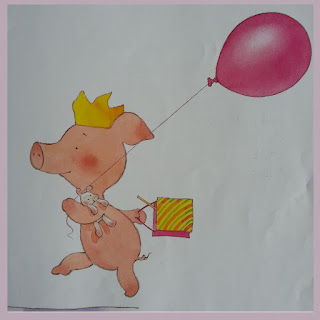
Illustrator...Mick Inkpen... Don't lose Pigley, Wibbly Pig!

I spotted this book on the dinning room table and it has to be one of the cutest storey books... beautiful watercolour illustrations with a lovely story...reminding little ones to take there time and do one thing at a time.

In the storey Wibbly has just been to a party and has been given a party bag... but he has two many things to hold and can't see everything in his bag and so he rushes and makes a mistake and his poor little to Pigley gets in to a spot of bother until... Wibbly stops and thinks and everything turns out okay in the end.

The illustrations are so innocent and the font for the text is so child friendly and bonces along the page perfectly to the story...

Fab watercolours...

Oooh what's in the party bag?!

How lovely is the font it looks handwritten in crayon...

Yay! Happy Wibbly Pig!

... it's not suprising it's sold millions of books worldwide!